For the last dozen
years or so I've been painting landscape paintings. I've pretty much developed
an impressionistic landscape style that is fairly unique. Not too
popular, but unique. Which is what counts. This style, however, does
not translate well into illustrations. It lacks detail and mine, at least often lack people. For A Summer
in Amber and Some Day Days, I managed to do two landscapes, that
while they're not really good cover illustrations, do at least set a tone
for the stories. The Bright Black Sea has so far evaded my attempts
to create a cover I like.
There are several
reasons for this. First, as I mentioned, is that my style is vague on
details, and most s-f book covers are big on details. Secondly, no matter how well designed the Lost Star is for it's environment, it
lacks gee-galls and thingamajigs sticking out all over the place to
make for an interesting cover illustration. The Lost Star is basically the most
boring space ship imaginable, from every angle. It doesn't even have
the fins like the old style rockets of s-f. Thirdly, being the author
of the story, I know the story too well to just page through the book
and find a scene that I care to do, irregardless of how important or
unimportant that scene is in the story. A good cover might be one of the battle
scenes, which have plenty of space ships and Star Wars type fighters.
Throw in a bunch of explosions and you have a typical space opera
cover. Except that episode plays only a small part of the story, and
would be misleading, since The Bright Black Sea is not a military s-f
book. I want to find something that represents the whole story, and
that mostly comes back around to the Lost Star/Starry Shore. The
boring old Lost Star without any thingamajigs.
Right now, the image
I am using for my non-Amazon cover is this one:


You simply need to
inverse it, rotate and crop it get rid of that house in the corner and put in a few “nova” effects in
Gimp and you have the cover – the Nine Star Nebula and a star or
two.
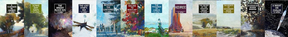
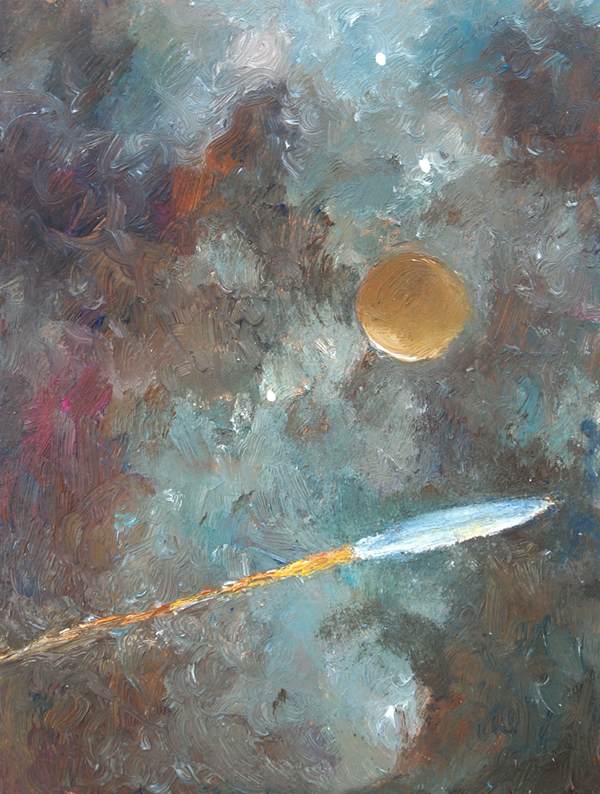
I did, at one time, knock off some small sketches, but none turned out good enough to use:
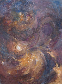


The four pieces above were all little 6x8" sketches.
I did, at one time, knock off some small sketches, but none turned out good enough to use:


The four pieces above were all little 6x8" sketches.
I also made several attempts to do a cover with the Lost Star more than a speck in the painting, neither of them made the grade:


In these cases, I used filters in Gimp to give them some additional and some
lighting effects as well. As I said, both turned out looking too crude and amateurish. The one I'm using
for my Amazon cover is another painting using Gimp filters, but does not have a crude space ship in it.
Recently, I tried one with people instead of the ship -- a scene from the Lost Star's bridge. As you
can see below, it did not go well. Still way too amateurish. Not professional looking at all. But there was one other problem, and
for me, a greater problem -- I don't want to define how
my characters look. I want to leave that up to you, the readers.
In part this
reflects a quirk in the way my mind works. I can't picture living
people in my mind. I recognize them, at least so far, but I can't
picture them. I have a little bit better luck picturing photos of
people, but still, it's pretty vague. Not surprisingly then, I have
no images of my characters in my head, just vague impressions of them. I'd probably recognize them if I met them, but I can't picture them. So rather than just
listing a bunch of characteristics for each that mean nothing to me, I keep
my descriptions very sketchy, and you can ignore them if you choose.
So by drawing for the cover, I was in some way defining them,
which I do't want to do. These stories are set 80,000 years in the
future and all the old earth ethnic types have long since been mixed and merged. Who knows what types have evolved in the long settled planets? The characters can look like whatever you want to look like. By making the cover below I felt I was compromising your freedom to imagine the crew of the Lost Star as you see them in your mind. As you can see, I tried to keep everyone as
undefined as possible, and well, it didn't work out in any case. This image doesn't look like how I envision things, so it forget it after you look at it. Please.


I haven't given up yet. 'm sure I'll make
another effort or two. I might try the more graphical approach you
see now days in covers. We'll see.

No comments:
Post a Comment