Books By C. LItka

Books By C. LItka

Friday, February 24, 2023

The Making of a Cover, Part Two

In my previous post I described how I put together my first cover, creating it more or less as a fun project to use on the beta versions of the manuscript. However, this past summer I decided to revert to a single, uniform design for all my covers – wrap around painted artwork for the paper version with two simple boxes. The collage version was neither painted nor did it wrap around, so I needed a new cover for the published edition.

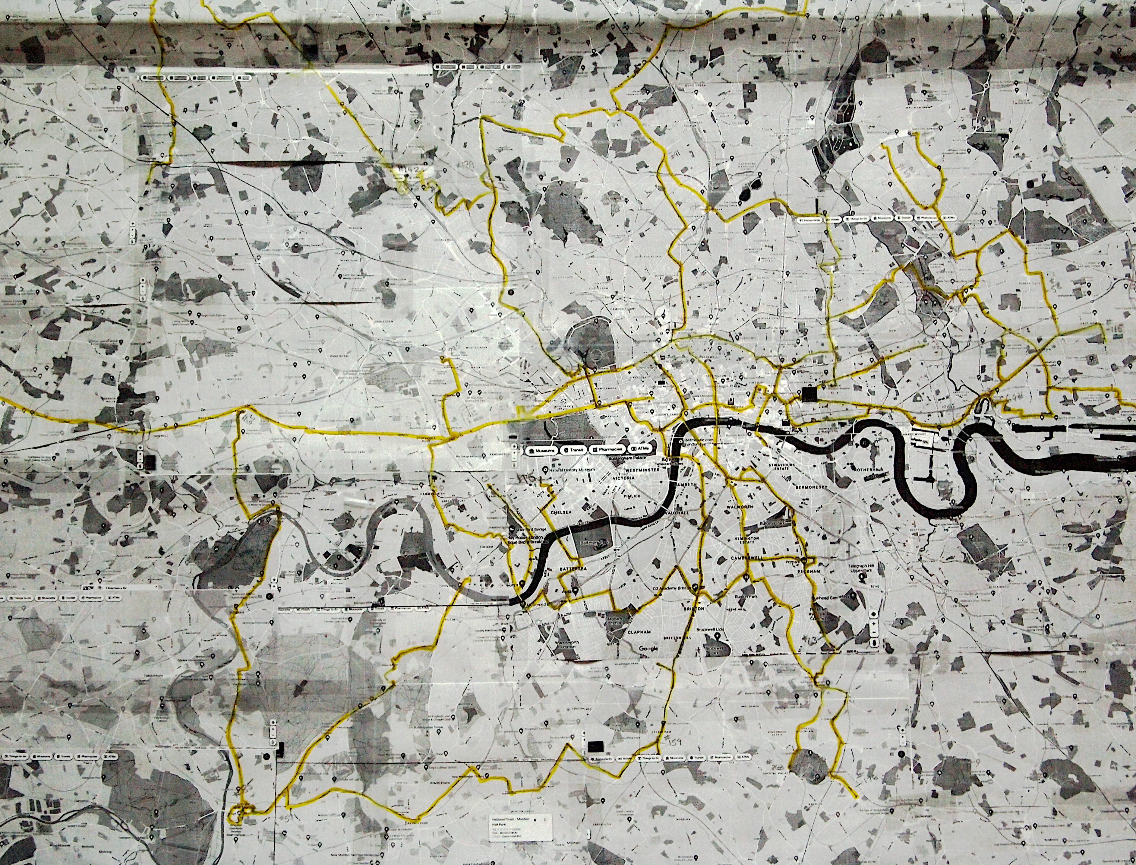
I have also posted about my first attempt to produce this painted cover. I'd chosen a scene just a few paragraphs into the story, but the complicated street scene proved too challenging for my talents, so I eventually abandoned it. Below is penultimate version of the painting before I abandoned it.


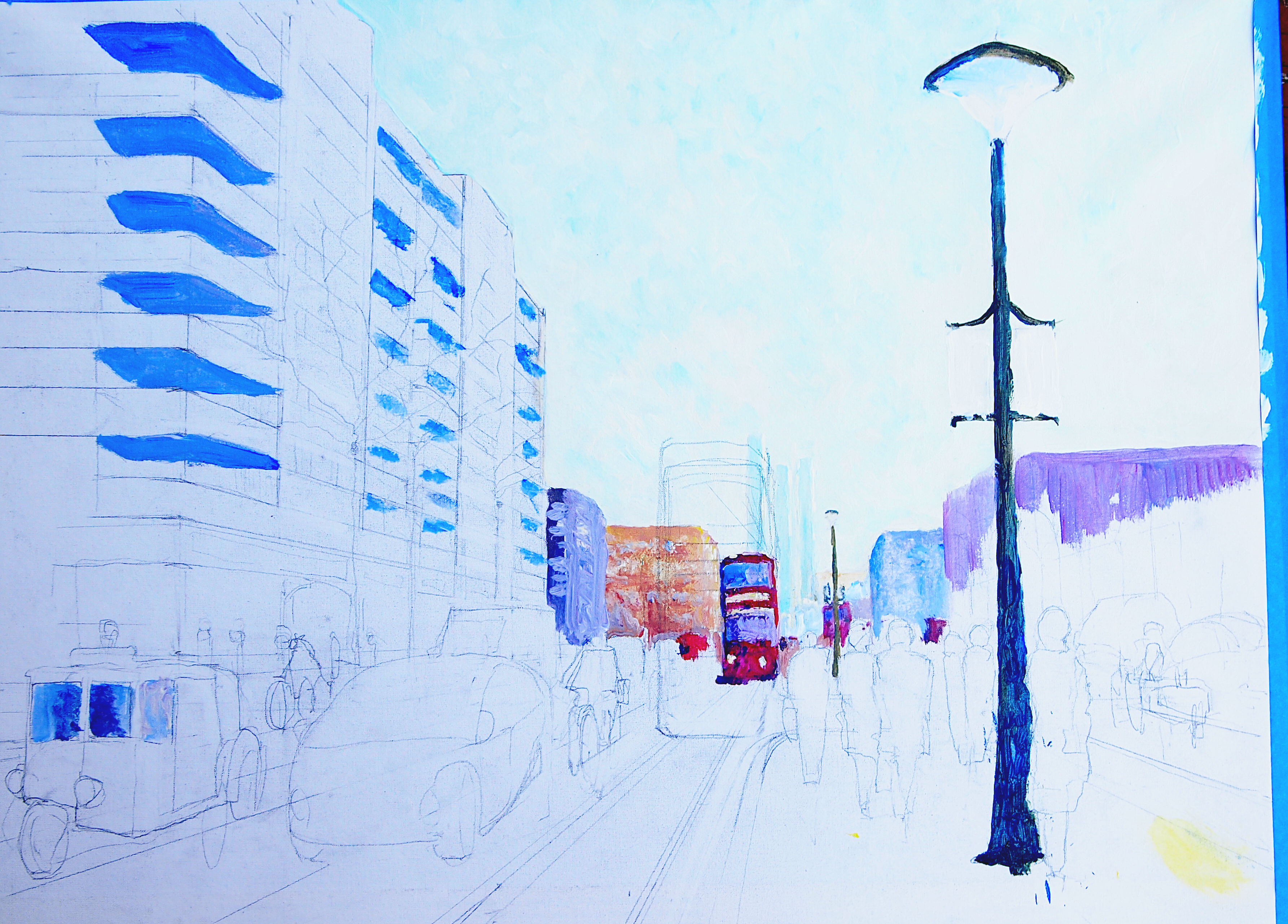
My first attempt, a pencil sketch, with some color, and some pencil revisions (i.e. a larger, closer tram)

Having abandoned my first attempt, I needed to come up with a) a scene from the book, or a general scene that would convey the mood of the book, and b) one that I could actually paint. Both of these requirements where a challenge. The latter because I haven’t been painting more than the covers of my books for three or four years now, and I’m out of practice. Really out of practice. You’d think you’d not forget how to paint, but it seems that I have. The former was just as problematical, in that it would be very hard to capture the mood of the story – or a scene from the story, with my talents.

Since the story takes the characters into the steppes of Ukraine, and includes incidents that involved traveling in cars, I considered a scene with a car driving down a narrow, dusty road – grass and wildflowers on either side, and a whole lot of sky above. I had painted similar scenes without the car before. Here's one example of what I was thinking about.


But without the ocean and hills. Just the foreground and sky.

While this seemed doable, I feared that the car might give me trouble, given my impressionist style of painting. As I said in the post about the first cover, if you paint in an impressionist style, you want to make sure that viewers know that your lack of attention to details is deliberate, not a result of incompetence, so painting something that looked like a car in the free, impressionist style would be a challenge. I was also having trouble designing the painting that would wrap around the print version. I needed the action - the car - on the front cover so the road would have to go to the left, as in the painting above, but where to put the car and how big in needed to be without it being lost... I hesitated.

Then one Saturday I happened upon the paintings of Grant Wood, and more specifically, his birds-eye view of Iowa. Below is one such painting, or rather it seems to be an oil sketch for a painting that I've yet to find the finished version of. I'm using it here because I think it the best of the series of such paintings,  I've never found a finished painting that is, in my opinion, as good as the sketch. I like the freedom of sketches over the more rigorous painting of the final version. Anyway, the sketch:


Grant Wood oil painting

Seeing those paintings got me to thinking. Could I take the same approach? Could I use a birds-eye view of flat farm fields stretching into the great distance of the steppes, conveying the vastness of a major setting in the book. It seemed doable, from my talent point of view, and in keeping with my general policy of going for mood over specific scenes. So I painted the picture below.

The thing about covers is that the painting only represents a starting point. Once I’ve taken a photo of it and uploaded it to my computer, I can manipulate many aspects of the painting; its light or darkness, its tone, and colors. I can and do add lines for shading and sharpness. I can eliminate or alter things and crop it as I choose. Given the limits of my talent, all this comes in very handy.

I went to work on the photo of this painting. Unfortunately I don’t have the complete paper cover of what I ended up with since I deleted the level it resided in, once I settled on the next cover. Gimp, as with most graphic programs, allows one to assemble an image in numerous layers. Each layer can be manipulated independently of the others. The cover art is my lowest level and I add things like the title box, book spine and back blurb box, as well as the text, each on its own layer on top of the cover art. At some point, I decided to eliminate this layer from the stack once I had settled on the next version. All I have is the front cover/ebook cover version of that cover, but it does show what I did to enhance the painting for the cover.


As you can see from the sky and fields, I lightened and brightened the painting, shifting its tone more to the yellows. I also added, as I usually do, some slight black lines to the painting using the "cartoon" filter in Gimp. This tends to sharpen the image, and give it a little texture or shadows. I also brightened and enhanced the plume of dust behind the car on the road.

As for the  painting itself, it was supposed to represent the largely flat steppes of what is now Ukraine with a village and a large estate on a ridge in the distance, that is one of the scenes in the story. However, in the end, I decided that this was not very good artistically speaking, and too abstract for the cover of the book, so I moved on to the version of the cover that I revealed several weeks ago. In the next and last instalment of this series, I'll talk about that cover, and show all the subtle ways a painting can be manipulated, since I still have something like four or five variations of that cover still potentially active in Gimp version of the cover. 

Friday, February 17, 2023

The Making of a Cover, Part One

On a whim, I submitted the manuscript that has become The Girl on the Kerb, to the British SF publisher Gollancz during a rare open window for manuscripts without agents, back in June 2022. They said I could expect to hear back from them in 6 to 9 months. This left me with a lot of time on my hands, and well, idle hands being the devil’s workshop, I’ve used the last 7 months plus to play around with all aspects of this book, including some significant revisions. In this and in two future posts, I will detail my extended efforts to create a cover for the book that began as EuraEast.

Below is the first version of the cover. For the background I used a 1913 copy of A Satchel Guide to Europe and one of the maps included in the guide book. The only thing I altered, is changing the “To Europe” on the book to read “To EuraEast” in Gimp, a free PhotoShop like program.


First cover, with its first title.

I thought the red book made the cover too dark, so I reluctantly changed it to blue. In addition, thinking that this cover was too plain, I went on to make a collage of it, adding several more elements to it that I created in Gimp. The first of these were Press ID’s from the fictional Gazette de Paree for my two main characters. Jeanne Murat and Henri Hardy (AKA Henri Tardy).

In researching Russian country houses for the story, I came across the photo below of a Russian family in the late 1800’s.  


Photo credit: https://artsandculture.google.com/story/zQVRWSShnjg7LQ

For some reason the daughter on the far left struck me as looking something like the vague idea of Jeanne Murat that I had in my head. I try to leave the image of all my characters up to each and every reader, but sometimes I do have an image in my head, and this unknown young woman, seemed to be Murat, though the braided hair she sometimes wears in the story also comes from how a host on YouTube sometimes wears her hair. Needing a mug shot, I decided to use this young woman on my ID card for Murat. For Hardy, I used an old photo of my late father-in-law, Frank, as he looked in his early 30’s. Frank was always an enthusiastic supporter of all my efforts, so this is a little tribute to him. Being small, I felt that they would not influence the readers' ideas of the characters too much.

I made the ID press cards from scratch. I found the globe graphic and designed them myself. I thought they came out pretty good. Missed my calling as an ID card designer.


In addition to the press cards, I created a newspaper clipping that is part of the story, with a murky photo of what was supposed to be a crashed flying machine. For the photo of the crash, I used a picture I took when I was 8 years old with my Kodak brownie box camera of a train derailment, and made it murky, knowing that most of it would be covered up by the guide book. I then added some shadows to give the effect of collection being in 3D, resulting in the cover below.


This then was my first complete cover. However, as I said, I had time on my hands, time to make changes, the first being to change the name of the novel to The Road to EuraEast because as I was writing it, I felt that it had a certain Hope and Crosby road picture feel to the story. At least that was something I was aiming for. Several months later, I changed the title again while I was querying agents. Being aware of a long series of books that have “The Girl” in the title, and thinking that the agents might actually be familiar with those books even as I doubted that more than one or two of the agent were old enough to be familiar with Hope and Crosby’s road pictures, I changed it to The Girl on the Kerb. And while the title does refer to one aspect of the story, I made this change with my tongue firmly in my cheek. This was one of several little jokes, including the novel’s opening lines setting out the stakes, that I did just to poke some purely private fun at the publishing world and its expectations.

However, after making this cover, I decided to revert to my original idea of having all my books have a standard cover design, as my trademark branding. In the last several years, I had drifted away from that idea, looking to make them appear more modern. I decided to return to my original standard and to do so very rigorously. That meant that not only would this cover have the standard size title & author box on the cover, but that it would have to be a painted cover as well to match all the other books, So, as the cover, the collage version was out. Unwilling to give it up entirely, I am using it as the first page in the paper version, below.


In the next installment, I will describe the creation of the first two attempts at a painted cover, both of which failed in one way or another.

Monday, February 13, 2023

Happy Birthday Sally!


We have a lot of February birthdays in the family, and today it's my dear wife's 72nd birthday. And since she has a new portrait photo, I thought I would post it here today on her birthday. Friends for nearly 50 years, married for nearly 45, mother of our two fine children, grandchildren to two more, she's my editor, proofreader, and partner for life. Love'ya Sal.

Saturday, February 11, 2023

Happy 99th Birthday Mom!


Here's a picture of my mother on her 99th birthday. She's starting her 100th year looking good.
Happy Birthday Mom. Love you. And many more!

Friday, February 10, 2023

Exploring London From Home


The future has proven to be something of a mixed bag for me. Still no Jetson style flying cars, and, to be perfectly honest, I’m getting a little discouraged about that. I’m beginning to think that I may not live long enough to own a flying car. On the other hand, we have the internet, and YouTube. YouTube allows me to travel without leaving my house, which is the way I like to travel these days. 


A west end residential street

As I have posted several times before on this blog, I’ve been traveling all across Europe in the cabs of trains for the last three or more years, thanks to the train drivers who record their trips and post them on YouTube. This winter I’m only spending half an hour pedaling my bike on a stand in the house and virtually riding the rails as I do so, so I am rather slowly making my way around the Iberian Peninsula, Spain and Portugal, so it may take me most of the winter to travel all the routes I can find through those countries.


A small town center absorbed into Greater London

However, I have found a new place to explore, in a new, virtual, way. London. And from the upper deck front seat of London’s iconic double decker buses. It seems that people take videos of their trips across London on its hundreds of bus routes and post them on YouTube. So far I am riding along with only one of these passengers, whose channel is called Wanderizm. You can find their videos here:

https://www.youtube.com/@Wanderizm/videos

Wanderizm also post videos of walks through various neighborhoods of London as well, if you want something more relaxing and detailed. There are other people posting bus ride videos as well, but Wanderizm posts a map of the bus route at the beginning of each video, and I am recording the routes I’ve ridden, as I do for my train rides, on a Frankensteinian map of London that I have pieced together from several dozen screen shots of Google Maps at a scale that at least shows every street. This has been a project of its own, but I have finally gotten a system down to keep the scale more or less consistant. Below is a photo of my map, with the routes I've taken in yellow.


Part of my Frankenstein map of Greater London, Routes I've ridden on so far are in yellow.

There are resources on the web that I think I could use to trace the routes that other such YouTubers post, even if they don't post maps, but for now, I’m sticking with Wanderizm until I’ve seen all of his. 

It is important to note that while you can place yourself on any street in London using Google's Street View, moving pictures are at least ten times more immersive than any still photo. The scene becomes truly alive since you can both see everything and everyone moving about, and hear the world you are traveling through. 


Dusk looking south to London from the surrounding hills.

As for London. Well, it’s been half a century since I was in London, and it has changed, like everything else. And it has changed a lot. Almost all of its many high-rise buildings have been built since I was there, and there are lots of high rise buildings these days in ol'London Town. I'm glad I visited it before they became so prevalent. And that I was also able to see a bit of "Dock Land" while it was still docks, and not high rise apartment buildings and such. 

On the other hand, much of it hasn’t changed much at all. There's still a lot of the old city wherever you go. And well, my bus trips have already taken me to so many parts of London that I never experienced when I was there, that every trip is an interesting adventure. I haven’t lived in a big city since Chicago in the early 1970’s, so big city life is a new experience for me. I am amazed at the thousands of small shops you find everywhere in the city, And of course, all those long streets lined with row house, grand, and modest, with long rows of "semi-detached" houses that were built in London's suburbs, as well as all the little town centers that have now been absorbed into Greater London in the last century. What is striking is the English fondness for trees and hedges in even the heart of London residential areas. 

The bus trips take you through rich areas, the poor areas, And you see people from all around the world and the old British Empire. And the fact that you rarely hear English being spoken on the buses. 

I like seeing where people live. I never bothered with museums, castles, and cathedrals when I was traveling about Britain 50 years ago, and it is the residential neigborhoods rather than the familiar hear of London that interest me today as well. So many places to explore…


Not the London I knew 50 years ago...

As for bus travel, well, it’s a whole lot more exciting than train travel. Even stressful. You have cars, cycles and scooters, bikes, lorries, and other buses navigating often very crowded and narrow streets. From the front of the bus, you can observe this often awkward dance of vehicles with a somewhat restricted view due to your position on the bus and the fact that it is being shot with a slight zoom lens, that has you just scraping by a stoplight when the bus makes its wide turn and hides cars and bikes in front of the bus. Plus, you can get stuck in traffic jams that can be annoying, even as a passenger. (Though you can skip ahead or view videos at 2X speed. Just saying.) All in all, a very different kind of travel from the hyper-controlled travel by train, but there’s something new every few seconds, unless you’re stuck in traffic. You can also play games like counting the number of KFC, McDonald’s, Dominoes, Subways or Starbucks you encounter on your trip. All in all, an interesting way to kill time, if you happen to have time that needs to be killed.


A city of shops


Friday, February 3, 2023

Cover Reveal for The Girl on the Kerb


"The red 8:25 tram crossed Crane House Lane and disappeared behind Villiers House, sealing my fate. I’d be late for work. I slowed to a walk and took another bite of toast. I found I didn’t care. It was that kind of day."

Yes, the cover illustrates the opening lines of the novel. What can be more iconic? Or is it a case of any port in a storm? In any event, this, or a minor variation of this will be the book cover when I release it. I will likely devote a future posting to all my efforts to create a cover for this novel, but for now, I’ll just leave you with it, and the current (unproofread) version of the blurb for The Girl on the Kerb.

The Girl on the Kerb is a new full length novel from the pen of C. Litka. This time around he has written an espionage novel filled with intrigue, adventure, and romance, told in his classic lighthearted style. Like all his novels, it features engaging characters, witty dialog, meticulous world-building, and mysteries to be solved in unexpected ways.

C. Litka’s previous novella Keiree was set on a far future Mars some 700 Martian years after a deadly plague had devastated Earth's solar system spanning civilization, leading to its complete collapse and the end of all space travel. So how did Earth itself fare in this catastrophe? Set on Earth in roughly the same time frame, The Girl on the Kerb answers that question.

Suffice to say that with its population drastically reduced, its natural resources utterly depleted, Earth’s surviving population must survive by endlessly recycling the leftovers of its Solar Age. To do so they live with an extensive set of rules, known as the Code, which regulates every aspect of society.

But there are still those who dream of rebuilding the fabled Solar Age and returning to space. One such dreamer is the Duchess of Fauconcourt, the administrator of Europe's EuraEast Region, who seems willing to defy the Code to do so, much to the alarm of her European neighbors. When a large and very illegal flying machine crashes in EuraEast, the administrators of EuraCentre and EuraNorthwest see the hand of the Duchess in the incident. They recruit two amateur agents, Jeanne Murat, an expert in EuraEast, and Henri Hardy, an engineer, to travel as a team to EuraEast seeking evidence to compel the World Government to preemptively act and foil the Duchess’ dangerous ambitions.

 Fate, however, had already chosen Murat and Hardy...

But it was ill luck that had their mission to the east immediately go south. They quickly found themselves in one perilous situation after another, even as they sought to uncover the Duchess’ secret plans.

Coming Soon!