 |
| The new collection |
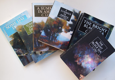
Nothing too pressing to report this week. The big news was that copies of my new paperback editions arrived. This redo of my paper books involved giving them all new covers with a standard design across the range, though not necessarily new artwork and a new, smaller size. I've posted about the inspirations and design process here: New Book Covers Again and show the full cover results here: https: New Book Covers. To quickly recap, I am thinking about ways to get my paper books into stores, and I wanted them to be what I think is a more typical size for trade paperbacks, 5.25 x 8" rather than my old size of 6 x 9" and I wanted matte covers like all the cool kids rather than the glossy ones I had previously used. Amazon will not let you change size or cover texture on published books -- it may be part of the bar code describing the product. In order to offer a new size I had to re-do all the books from scratch and unpublished the old versions.
New cover art for the Bright Black Sea, though in fact I used the art from the first version of this book for the new cover. Because of the size of this book, and that of The Lost Star's Sea, with the significant downsizing of the page area, the font size had to be reduced to what you usually find on a mass market paperback. The alternative would have been to break each of the books down into three volumes. For The Bright Black Sea this would be no problem, since it was written as three books. It would be more problematical for The Lost Star's Sea as that was written as a series of novella length episodes. I decided against it for now, as it would most likely just create confusion.
Above are two samples that kept the same artwork, but I found it interesting how I framed the artwork differently between the two editions. I guess there is no right way.
I am quite happy with these new editions. I like the matte cover, it has a velvety feel to it while still offering vibrant colors, which was my main concern. I like the new size, and I like the uniformity of design. I had abandoned that uniformity over the last couple of years, but I'm happy to go back to it. My old argument was that is was for "branding" purposes i.e. you knew a C. Litka book when you saw it. And I'm now back to that argument. The refrain one hears is that covers sell the book. That may be the case, but I've changed covers often enough over the last seven years, including new artwork, and have never seen any difference in sales. Your cover has to be seen for it to make a difference, and in publishing these days, being seen is the big challenge. Covers don't make a difference if they are not seen. My next challenge is to get my books seen. I'm working on that.


No comments:
Post a Comment