
Writing a story is only half of a book. Turning the manuscript into a book and publishing it is the other half. Writing takes more time but putting together a book and getting it into stores is the essential second step. So what is my process of producing a book?
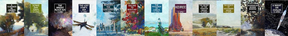
Let's start with the cover. I create my own covers by painting a picture with actual paint on hardboard, ideally, specifically for the story. I have, however, repurposed digital copies of paintings I painted years ago for some of my covers. The current covers for Tzasritsa Moon, Valsummer House, and Iron Kingdom are all repurposed art. I initially released them with original art, but wasn't happy with those covers, and so swapped in better art, even if its connections to the stories are a bit of a stretch. Other examples of re-purposed art include the current cover for The Lost Star's Sea and A Night on Isvalar, though, Isvalar's cover is a scene from an old comic book version of that story I did.
 |
| The original Tzaritsa Moon cover art |
In any event I use hand-paint original art for all my books. Not being an illustrator, I settle for trying to capture the story's mood by using scenes that I, as an impressionist landscape artist, feel comfortable attempting.
I paint each cover to use as a wraparound cover. This means that the main action is on the right side of the painting, i.e. the front cover. Having to fit the key elements in half of the painting usually makes for an awkward painting. However, I'm never too concerned about the painting, knowing that I can work with it "in post" i.e. once I take a photo of it and upload it to my computer where I use the free Photoshop-like app, Gimp, to correct its shortcomings. This may include cropping the original painting for fit and focus, and altering the color balance and contrast. I usually add a "cartoon" effect, i.e. black outline to the image as well, to sharpen it up. Some covers I do this more than others, and some, probably too much, at least for the paper version.
 |
| The photo of the original art for The Red Wine Dossiers |
Except for a brief period, I've given all my books a uniform cover design. These days I use a title box in the same position on every cover, and a blurb box on the back of the paperback. This design serves as my brand.
To produce the paperback cover, I discover number of book-sized pages once I copy and pasted the text into the proper page size for the book. To save time I then select the cover art file from a similarly long book, as a template. I rename and save it to the new folder for the new book. Then, because every element of the cover - the painting, text boxes, and the text itself, have their own layer, I can delete the elements I don't need and then add new elements of the new cover, i.e. the new artwork, change the color of the title box, spine and back blurb box, and add new text over these sections. Using this method I can produce a cover in an hour or two. I also create a square version of the cover for the audiobooks.
 |
| The wrap around cover done |
For ebooks I use the old Smashwords style guide for the text, and then upload that file and the single page ebook cover to Draft2Digital. I let D2D format the epub version, using their minimalist style. I then download their epub version and use that version for Amazon, Kobo, and Google (usually), since they all accept epub files, plus it comes with a table of content, which I can't produce on my own. This way, I really don't have to format the ebook myself.
As for the paperback version, well, I grew up reading mass market paperbacks, and that's the standard I adhere to. While there are those who view books as works of art, and I give them the joy of it, I view books as storytelling tools. I don't bother with headers. If you don't know what book you're reading, by whom, I don't think the header is going to help you very much. I don't use doddles and do-dads to decorate chapter headings. I don't cater to the typeface-fanatics. One typeface is pretty much as good as another. I generally use 11 pt. Liberation Serif, which is likely a Times New Roman clone. I have also used 12 pt. Goudy Old Style in some of my books, and 9 Pt Liberation Serif on my two 350K word books.
I create the text of the paper book using LibreOffice with a page size that matches the paper book and set it up as mirrored pages. I set the margins and the size of the footer. I use a larger than the minimum inside gutter so that the reader doesn't have to peer around the inside fold to read each line. I place the page numbers in the footer. I either then copy and paste the ebook text on to this page, or start by creating the title pages, and copying and pasting the complete text after I've created the set of title pages - which is probably the best way, because as you're messing around with the title pages, every page down stream can be affected as well.
I have all chapters start on a righthanded page. I do this by spacing rather than using page breaks. This can be a headache, but since you really need to go through the whole book several times to make sure any little change you've made hasn't had ramifications twenty pages or more into the book, doing this manually kills two birds with one stone.
In LibreOffice you can specify how many pages are title pages, and they should be separate from the text. Actual pages numbers should start with the first page of Chapter One. This I can do. However, I always have trouble getting the title pages not to have their own page numbers, though it seems possible in the settings. Very frustrating. I usually give up and end up adding a small white graphics over the page number to cover them up.
I use at least six pages for the title pages. Books with the title page on page one scream "Self-Published!" to me. No professionally published book, even all those cheap mass market paperbacks, have the title page on page one. I use page one for an illustration and a short blurb. Page two has my list of books, then the title on page three. Page four is the copyright page. I like books with maps, so if I have a map, I use page five for the "Thank You" to my beta readers and a dedication if I have one, and then use page six for the map. If I have more maps or other graphic elements, I will add more pages, and perhaps perhaps place the thank you and dedication on the copyright page, if need be. Every book has its little issues that have to be worked out.
When I have the final page count, I need to go to Amazon to find the exact size of the cover I'll need for the specific page count, and then slightly adjust both the cover size, and the width of the spine in Gimp. Luckily every element you add in Gimp loads to the exact center of the image, so the spine always is in the right place when you add it to the file.
Once everything is in place, I "flatten" all the layers on the cover art in Gimp and export it as a jpg. I then create a LibreOffice document in the size of the cover, and insert the cover art onto it. I then export this as a PDF. Once the text is right, I export it as a PDF as well.
I only publish my paperback books with Amazon, as it is cheaper, and the only place I'll even bother trying to sell my paper books. So I upload the PDF of the cover and interior text to Amazon, and let them do their magic. I go through the entire book again in their review, and if everything is okay, I choose a price and publish. I keep the price low. I may make a dollar and change on a $13 book, since I ain't in this for the money.
Audiobooks use the ebook text to create an auto-narrated book, which I think is an essential tool for small self-publishing authors to reach a wider audience and who's business can not justify a human narrator. Writing speculative fiction, I make up a lot of words, so it pays to go though the text to get them to sound sort of like I want them to. In Google I can go through a list of questionable words to check how they are being pronounced. For example, my "Mz" Google pronounces as m -z, instead of "mizz" but I can correct that. Apple gives me no option. Apple knows best. With Amazon you need to listen to the text to hear questionable words, though they can be corrected. Apple and Google require square covers, Amazon does not.
This may seem like a lot of work, but I've probably spent more time writing and revising this post than producing and publishing a book, not counting painting the cover. LibreOffice is a lot like Word, so it should be easy to use to produce the text for a paper book. Because I used Photoshop back when I was working for a small daily newspaper, working with Gimp is fairly familiar, for what little I need it for. But it is not for everyone. However, I know it is possible to produce good covers using the free version of Canva, or going all in for a month to get better options when the book is ready. Of course not everyone is an artist, or has an eye for design, but anyone can study the covers of best selling books in their genre, and then find similar artwork in Canva or some other source, and arrange it, and the title text, onto a book cover template that mimics the covers readers expect.
I feel strongly that self-publishing authors should embrace the "self" part of publishing. We should learn how to produce our own books, including covers. My work experiences gave me a leg up when it came to producing paperback books. But I think that learning how to use an app like Canva that includes resources for making covers is a viable option for everyone. The idea of hiring editors, cover artists, and formatters is foreign to the ideal of self-publishing, and often a scam at one level or another, as well as an approach that rarely pays off.